Cause-and-Effect Paths
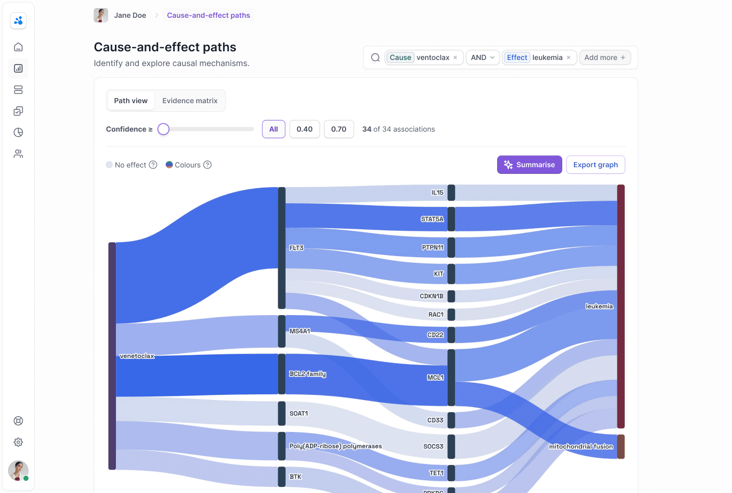
Researchers were abandoning Biorelate's most-used feature and exporting raw data to spreadsheets instead. I led a redesign that re-encoded how evidence strength was shown in the visualisation, so researchers could judge which relationships were worth investigating at a glance. Engagement rose 42% and people stayed in the tool rather than leaving for Excel.
- Role
- Head of Product Design & UX
- Company
- Biorelate
- Period
- July — November 2023
- Category
- Data Visualisation
Overview
Problem
The most-used feature on the platform was also the most abandoned. Researchers could not tell which relationship paths were worth their time, so they exported everything to a spreadsheet and filtered by hand. A major data update was about to make the diagram unusable at scale.
What I did
Twelve interviews and session recordings showed the problem was the information model, not the styling. I colour-coded paths by evidence strength and added interactive filtering, the one option that fit a Sankey library with almost no per-path control and a fixed engineering window. Testing then killed the numeric scores: High, Medium and Low did more for usability than the visual redesign around them.
Outcome
Over three months after launch, engagement with the feature rose 42%, retention rose 35% and session depth rose 54%. Researchers stayed in the tool instead of leaving for Excel.
Context
Galactic uses NLP and machine learning to pull causal relationships between drugs, genes and diseases out of published biomedical literature. The core feature, a Sankey diagram called Cause-and-Effect Paths, was the most-used part of the platform and also the most complained about. I led the redesign as design lead, working with one engineer and drawing on interviews with 12 researchers.
There was a deadline behind it. Biorelate was about to push its largest-ever data update, which would multiply the volume and complexity of the relationships on screen. The existing design already struggled at current scale; at the new scale it would have been unusable. So this was not a tidy-up. It was a question of whether the feature survived the update at all.
The real problem
I started with the 12 interviews and a stack of Pendo session recordings. The thing that changed my approach: researchers were not struggling because the diagram was ugly. They were struggling because they could not tell which relationship paths were worth their time and which were noise. A query could return dozens of connections that all looked equally important, so people gave up on the visualisation, exported everything to a spreadsheet, and filtered by hand.
CommentThe fix was not visual. It was about the information model: evidence strength had to be encoded into the diagram itself.

Treat it as a styling job and I would have shipped a prettier version of the same dead end. A researcher needed to prioritise without reading every path.
The decision that mattered
I worked through four approaches, constrained by a Sankey library that barely supported per-path styling, which ruled out a full rebuild and pushed me toward tight, high-leverage changes:
Brand-new chart type
Most control, but abandons a Sankey researchers already knew, plus far more engineering.
Separate filter panel
Filtering alongside the Sankey, but leaves the diagram itself just as unreadable.
Colour-code paths by confidence
Plus interactive filtering. Improves readability with no new visualisation to learn, and the only option that fit engineering capacity.
Hybrid Sankey + detail table
Simplified overview with a linked table beneath: strongest, but beyond our engineering window.
What testing changed
We tested with 8 users, and the most useful result was the one that proved part of my plan wrong. We had kept the numerical confidence scores as tooltips, treating them as a harmless secondary detail. They were not harmless. Users kept asking what a score of 0.73 actually meant. One researcher said he would ignore any path unless someone told him the threshold for "reliable," which defeated the entire point of showing confidence.
So I cut the numbers. We replaced them with High, Medium and Low, tied to the colour-coding, with a short explanation on hover. We did not reduce the data; we changed how it was communicated. That single change did more for usability than the visual redesign around it.
Impact
We launched to all users in November 2023 and tracked the result over three months in Pendo. Engagement with Cause-and-Effect Paths rose 42%, with more researchers using it as a primary exploration tool rather than defaulting to raw tables. Retention improved 35%. Session depth rose 54%: researchers followed more relationship paths per session instead of giving up early.
Native Competitive Bidding
Transparency as the design goal, not speed
View project ↗
Josh VenterOpen to conversations about design-leadership roles.