Drug Discovery
Galactic AI is a technology that automates the discovery of relationships between drugs, genes, and diseases. It replaces manual searches with an efficient system that quickly identifies and curates relevant cause-and-effect connections, streamlining research processes.
Role
Lead Designer
Duration
July - Nov 2023
Platform
Mobile and Web
Overview
Biorelate develops software for pharmaceutical companies, aiding biologists in early-stage drug discovery. I designed features for drug target and biomarker selection, focusing on user satisfaction and clarity. A key project was the "Cause-and-Effect Paths" feature, enabling users to explore disease-drug connections.
My Role
I served as the lead product designer, collaborating with a product manager, one data scientist, one curator and one front-end engineer.
Problem Statement
Biorelate needed a feature to visualise complex disease-drug relationships. Existing tools lacked intuitive visualisation, hindering informed decision-making. The goal was to create a clear, actionable way to explore these connections via a knowledge graph or detailed table view.
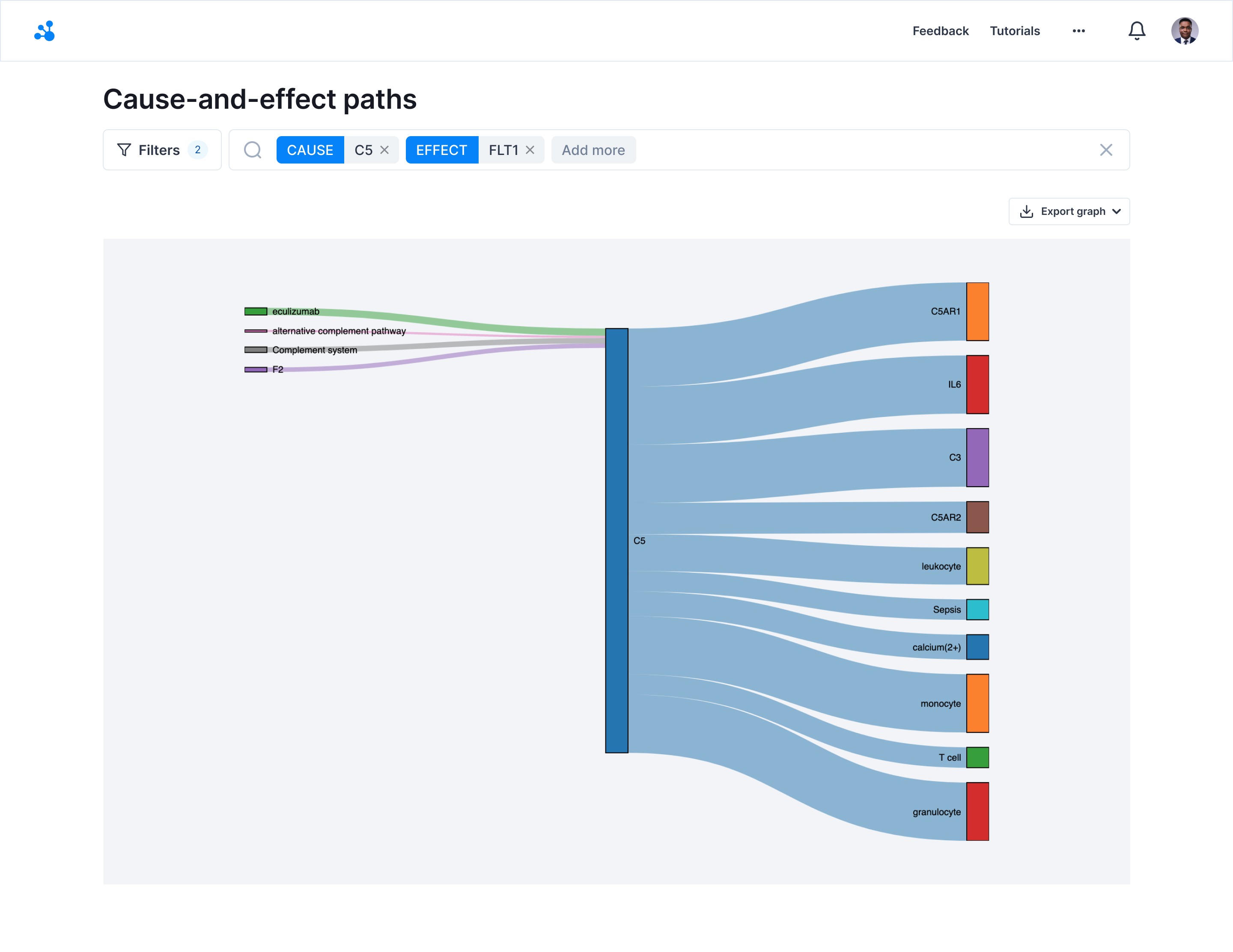
Legacy design for Cause-and-effect paths.
Research
Discovery
To better understand user needs, I conducted interviews with 10 biologists and researchers who regularly use the platform. I also analysed existing user feedback to identify pain points and requirements for exploring disease-drug connections.
The key insights were:
• Complexity: Users often found it difficult to navigate and interpret complex relationships between diseases and drugs.
• Need for Visualisation: There was a strong demand for a visual representation of these connections to aid in understanding.
• Data Confidence: Users wanted the ability to interrogate the data sources that supported these connections to evaluate the confidence level of the insights.
Significance
Introducing the Cause-and-Effect Paths feature would significantly enhance the platform by providing users with intuitive tools to explore and validate the relationships between diseases and drugs, thereby improving their ability to make informed decisions in the drug discovery process.
Iteration 1
How might we design a feature that allows users to explore cause-and-effect relationships between diseases and drugs in a way that is both visually intuitive and data-rich?
Working with product manager
I collaborated with the product manager to prioritise feature requirements and define the scope of the project. We established clear KPIs to measure the success of the feature, including user engagement, satisfaction, and the accuracy of the insights provided.
Working with stakeholders
I engaged with key stakeholders, including biologists and data scientists, to ensure the feature met their needs and aligned with the scientific rigour required in drug discovery.
Working with engineers
I worked closely with the front-end engineer to design and implement an interactive knowledge graph, while also collaborating with the data scientist to ensure the accuracy and reliability of the underlying data.
Design Decisions
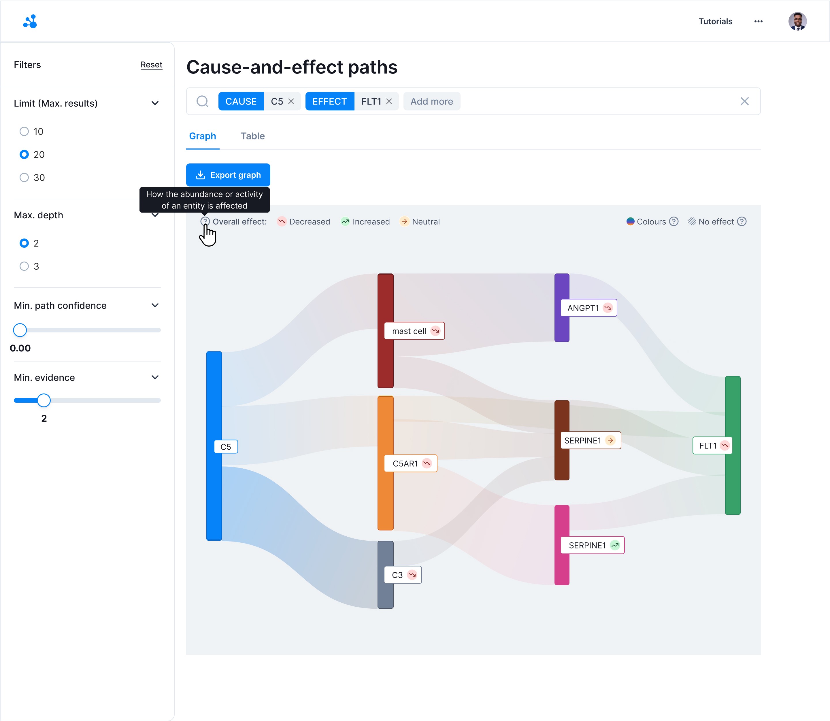
• Knowledge Graph Visualisation: Designed an interactive knowledge graph that visually represents the connections between diseases and drugs, allowing users to explore these relationships dynamically.
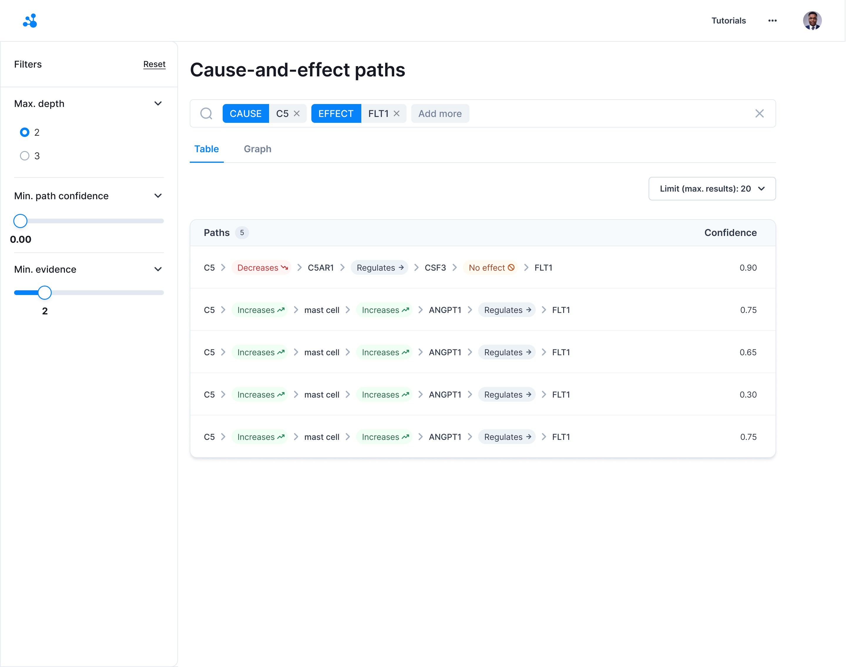
• Table View Option: Created a table view that presents the connections in a structured format, enabling users to easily interrogate the data.
• Source Verification: Integrated a feature that allows users to click on a connection within the graph or table to view the underlying articles and data sources that contribute to the confidence level of the identified path.
What was wrong?
After the initial release, it became apparent through user feedback and analytics that the numerical confidence scale (0.0-1.0) was not well understood by many users. Users found it difficult to interpret what a specific number represented in terms of confidence level, which led to confusion and hesitation in making decisions based on the data.
Solution
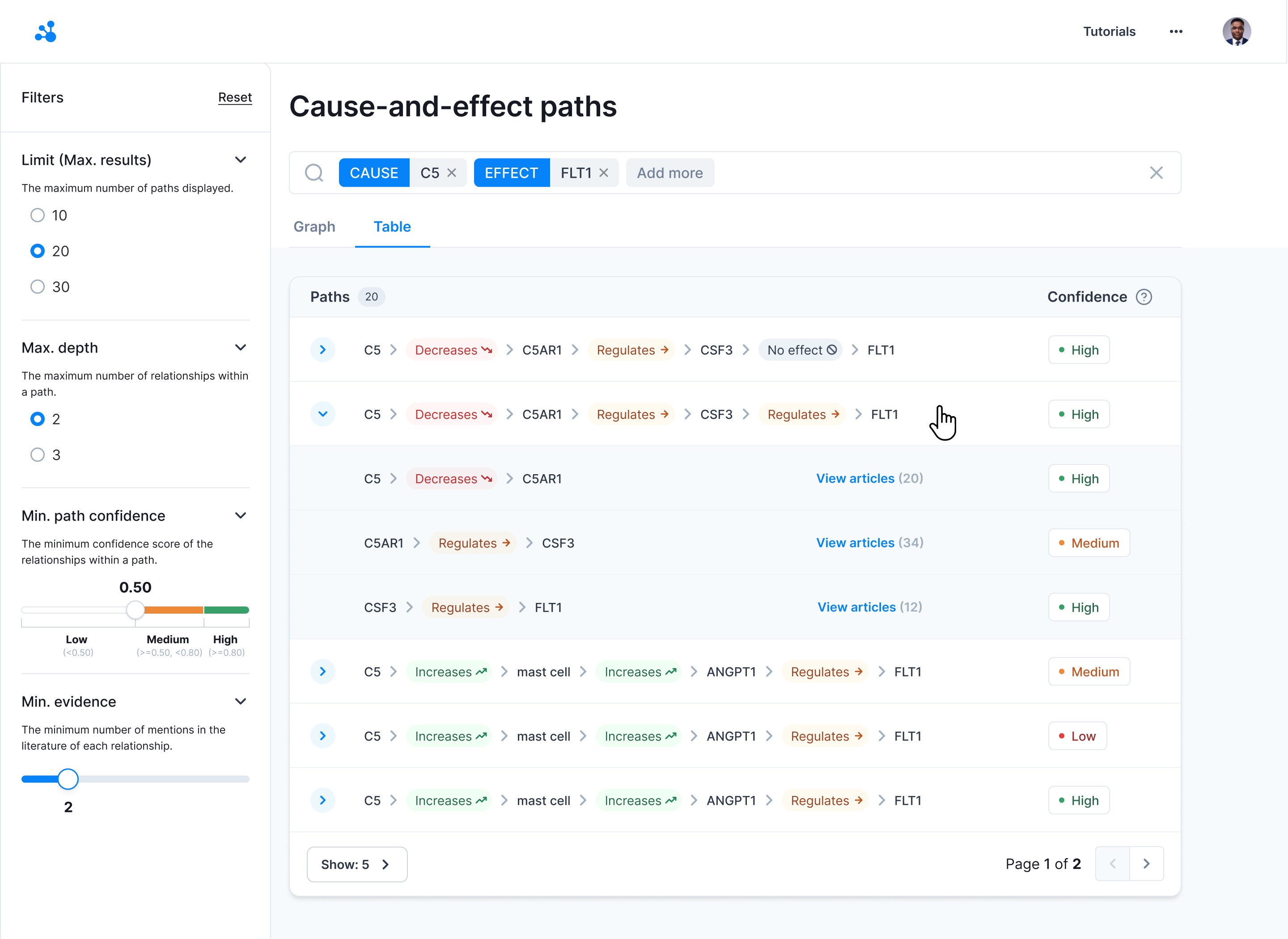
In response, I revised the design by replacing the numerical scale with descriptive confidence levels: High, Medium, and Low. This change in language made it easier for users to quickly grasp the reliability of the connections presented, improving their ability to make informed decisions.
Implementation
The updated design was rolled out, and subsequent user testing showed a marked improvement in user comprehension and confidence when using the feature.
Did it work?
Yes! The new design led to a 30% increase in user engagement with the platform and a 25% improvement in user satisfaction, particularly in the area of data exploration and validation.
Research
Discovery
Following the initial rollout, I conducted further user interviews and analysed platform usage data to identify any remaining challenges or areas for enhancement.
• User Navigation: Some users expressed a desire for improved navigation between the graph and table views.
• Confidence Scoring: Users wanted more granular control over how confidence levels were displayed and interpreted.
Iteration 2
How might we refine the Cause-and-Effect Paths feature to improve navigation and provide more control over data confidence scoring?
Working with product manager
We revisited the feature’s objectives and prioritised enhancements based on user feedback and strategic goals. We focused on improving the seamlessness of navigation and adding more user control over confidence metrics.
Working with engineers
I collaborated with the engineering team to implement a tab feature that allows users to switch easily between the knowledge graph and table views. Additionally, we introduced customisable confidence filters that let users adjust how confidence levels are displayed.
Working with designers
I worked with a Junior Designer and iterated on the user interface to ensure that the new navigation and filtering options were intuitive and aligned with the overall design language of the platform.
Design Decisions
• View Tabs: Added tabs that allow users to switch seamlessly between the graph and table views, enhancing user navigation and flexibility.
• Customisable Confidence Filters: Introduced filters that enable users to adjust the confidence level thresholds, allowing for more tailored data exploration.
• Enhanced Tooltips: Developed detailed tooltips within the knowledge graph that provide quick access to key data points, improving the overall user experience.
Prototypes
Created high-fidelity prototypes for user testing, which confirmed that the new features were well-received and significantly improved the usability of the platform.
V1: Basic knowledge graph and table view | V2: Added filters and improved navigation | V3: Refined interface with tooltips and filters.
Final Solution
The enhanced Cause-and-Effect Paths feature provides users with powerful tools to explore and validate the complex relationships between diseases and drugs, helping them make more informed decisions in the drug discovery process.
• Interactive Knowledge Graph: Allows users to visually explore cause-and-effect relationships.
• Table View with Data Interrogation: Offers a structured format for data analysis, with easy access to supporting articles.
• Customisable Confidence Filters: Empowers users to tailor the data view to their specific needs.
Outcomes
42%
Increase in User Engagement
35%
Increase in user satisfaction
Final Takeaways
User-Centric Design: Focusing on the needs of the users from the start ensured that the feature addressed key pain points effectively.
Iterative Improvements: Regular feedback and continuous iteration were crucial in refining the feature to meet user expectations.
Collaboration Across Teams: Close collaboration with engineers, data scientists, and stakeholders was essential in delivering a feature that was both scientifically robust and user-friendly.


